
File preparation guide
How to prepare your files for print
A practical, step-by-step guide to bleed, colour, resolution and PDF export — so that what you designed is what comes off the press.
Most printing problems are not printing problems. They start in the design file, weeks earlier, and they are almost always cheap to avoid and expensive to fix. This guide explains what a printer actually needs from you, why, and exactly which buttons to press in the software you already use.
If you read only one thing, read the checklist at the end. If you are about to start a new project, read section 1 first — it will save you the most time.
What’s in this guide
- Before you start designing
- Bleed, trim and safety margin
- Colour: why your file has to be CMYK
- Images and resolution
- Fonts and fine detail
- Setting up the document correctly
- The cover is a separate file
- Exporting a print-ready PDF, step by step
- Check your PDF before you send it
- Sending the files to us
- The mistakes we see most often
- The pre-flight checklist
1. Before you start designing
A handful of decisions have to be made before anyone opens a design file. Getting them wrong usually means rebuilding the whole publication, so please talk to us at the concept stage — not the day before the deadline.
Agree these with us first:
- Trim size — the finished size after cutting, in millimetres (e.g. 210 × 297 mm).
- Total page count — including blanks, endpapers and inserts.
- Binding — softcover (perfect bound), hardcover (case bound), section sewn, saddle stitched, Wire-O, Swiss binding, layflat.
- Paper — type, weight and finish for the text block and for the cover. Paper determines the spine width, so we cannot give you a cover template until this is fixed.
- Colours — 4/4 CMYK, 1/1 black only, mixed sections, or Pantone spot colours.
- Finishing — matt / gloss / soft-touch lamination, spot UV, hot foil, embossing, die cutting, rounded corners, ribbon, head and tail bands.
Once those are fixed we will send you the exact spine width and, on request, a cover template with the bleed, wrap and hinge areas already drawn in. Design into our template and the cover will fit.
2. Bleed, trim and safety margin
Paper moves. A guillotine cutting a stack of several hundred sheets is accurate to roughly ±1 mm, and folding and binding add their own tolerance. Everything in this section exists to absorb that movement.
The three lines on every page
- Trim line — the finished edge of the page. This is your document size.
- Bleed — extra artwork extending 3 mm beyond the trim line on every outer edge. Any background, image or colour block that is meant to touch the edge of the finished page must run out into the bleed.
- Safety margin — an inner zone, at least 5 mm inside the trim line, that contains nothing you cannot afford to lose. Text, page numbers, logos and faces stay inside it.
Why bleed matters
If a photo stops exactly at the trim line and the cut lands 0.5 mm outside it, you get a thin white sliver down the edge of the page. It is one of the most visible and most common defects in amateur print files, and it cannot be repaired after printing. With 3 mm of bleed, the same 0.5 mm of drift is invisible.
The gutter — the margin people forget
In a bound book, part of the inner margin disappears into the spine. Keep at least 10 mm of inner margin in a perfect bound book, more for thick books, and never run text across the gutter in a perfect bound title — it will curve into the glue and become unreadable. Images may cross the gutter; body text should not.
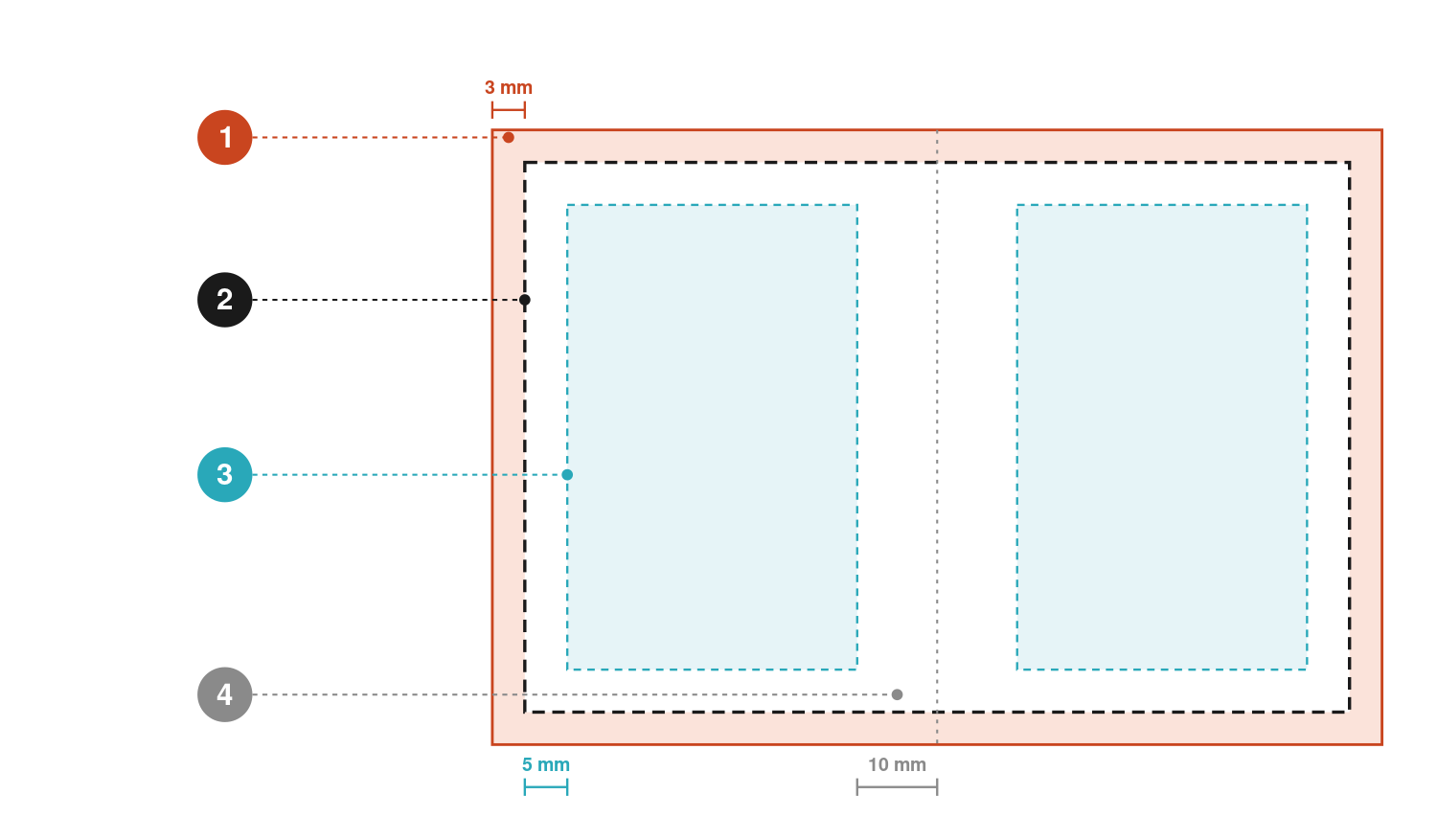
- Bleed — 3 mm. Artwork extending past the trim line on every outer edge. Any background or image meant to touch the edge of the finished page must run out into this band.
- Trim line. Where the guillotine cuts. Its real position varies by up to ±1 mm — which is the whole reason bleed exists.
- Safety margin — 5 mm. Text, page numbers, logos and faces stay at least this far inside the trim line.
- Gutter — 10 mm. The inner margin at the spine. Part of it disappears into the binding, so nothing you need to read belongs there.
3. Colour: why your file has to be CMYK
RGB and CMYK are not two versions of the same thing
Your screen emits light. It builds colour by adding red, green and blue — start from black, add light, get white. Print does the opposite: ink absorbs light, and colour is built by subtracting it with cyan, magenta, yellow and black (K) on white paper. Start from white paper, add ink, get black.
The consequence is that the two do not cover the same range of colours. RGB can display vivid saturated colours — electric blues, neon greens, pure oranges — that no combination of four process inks can reproduce. If you send an RGB file, someone or something has to convert it to CMYK, and those out-of-gamut colours will drop back to the nearest printable equivalent. A brilliant RGB blue comes back a duller, greyer blue. A neon green comes back olive.
The question is never whether the conversion happens. It is who controls it. If you convert it yourself, in your own software, with the correct profile, you see the result and can correct it. If you leave it to us or to a RIP, you find out on the printed sheet.
Which profile to use
A CMYK file is only meaningful together with an ICC profile that says what kind of paper and press it describes. Unless we have told you otherwise, use:
| Paper | Profile | Standard | Max ink |
|---|---|---|---|
| Coated (gloss / matt / silk) | PSO Coated v3 | FOGRA51 | 300% |
| Coated — legacy, still widely used | ISO Coated v2 | FOGRA39 | 330% (300% in the “300%” variant) |
| Uncoated, wood-free | PSO Uncoated v3 | FOGRA52 | 300% |
| Uncoated — legacy | PSO Uncoated ISO12647 | FOGRA29 | 300% |
Your application probably does not have these two v3 profiles yet. Adobe still ships the older European set — Coated FOGRA39 and Uncoated FOGRA29 — and PSO Coated v3 and PSO Uncoated v3 are not among them. They are free to download from eci.org. Installing them once is enough; where they appear afterwards depends on the application.
- Adobe InDesign, Illustrator and Photoshop. Install the .icc files in the operating system, restart the application, then pick the profile under Edit → Colour Settings → Working Spaces → CMYK.
- Affinity Publisher, Photo and Designer. They keep no profile library of their own and simply list whatever the operating system has, so installing the files is all that is needed.
- CorelDRAW. Either install into the system colour folder or load the profile into the application’s own Color folder — the program reads both.
- QuarkXPress. Put the files into the Profiles folder inside Required Components in the QuarkXPress application folder, or point Utilities → Profile Manager at another folder, then restart.
Where the files go: Windows C:\Windows\System32\spool\drivers\color, macOS ~/Library/ColorSync/Profiles. If you genuinely do not know what the job
prints on, ask us before you convert anything.
Total ink coverage
The sum of the four ink percentages in any one spot must not exceed 300%. Above that, the ink cannot dry fast enough: it sets off onto the back of the next sheet, marks during folding, and can crack at the fold. A “black” mixed as 100/100/100/100 is 400% and will cause problems on any press.
Blacks: two different jobs
- Small text, thin rules, barcodes: 100% K only. Nothing else. Black text built from four inks needs all four printing units to register perfectly; a hundredth of a millimetre of drift and the letters look blurred or fringed with colour.
- Large solid areas: rich black. 100% K alone on a big panel looks washed out and grey-brown. Use a supporting mix — C 60 / M 40 / Y 40 / K 100 (240% total) is a safe, neutral recipe on coated stock. Ask us if you want to match a specific deep black across a whole cover.
Spot colours
If the job is quoted as 4-colour process, there must be no Pantone swatches left in the file — check your swatch palette and convert them, or we will, and the result may surprise you. If you are genuinely printing a spot colour, name the swatch exactly as the Pantone reference, define it as a Spot (not Process) colour, and use the same swatch consistently across every file.
Black-and-white interiors
A mono text block should be greyscale or 100% K, not CMYK. A “black and white” photo left in CMYK carries traces of the other three inks and will print with a colour cast — and you will be paying for four inks on a job quoted as one.
4. Images and resolution
- 300 ppi effective resolution at the size the image is actually used. An image that is 300 ppi at 100 mm wide is only 150 ppi if you scale it to 200 mm. Check effective resolution in your layout program (InDesign: Links panel → Effective PPI), not the image’s nominal size.
- 1200 ppi for pure bitmap line art (scanned drawings, technical hatching).
- Never upscale. Enlarging a small image adds pixels but no detail. If you only have a 600 px photo, use it small or find another one.
- Do not use images from websites. They are typically 72 ppi, RGB and already JPEG-compressed. On paper they look soft and blocky.
- Logos should be vector (AI, EPS or PDF), not a PNG lifted from a web page.
- Place, don’t paste. Use File > Place so images stay linked and at full quality. Copy-pasting from a browser or from Word degrades them.
- No missing or modified links at export time. Check the Links / Resource Manager panel before you export.
5. Fonts and fine detail
- Embed every font in the PDF, or convert type to outlines. A non-embedded font gets substituted and your layout reflows — different line breaks, different page count.
- If you outline your text, keep an editable copy. Outlined text cannot be corrected, and last-minute corrections are normal.
- Never use “faux” bold or italic buttons that synthesise a weight the font does not have. Use the real weight from the family.
- Minimum sizes: positive text (dark on light) no smaller than 6 pt; reversed text (white out of a colour) no smaller than 8 pt and preferably in a weight that will not fill in. Reversed text out of a four-colour build is the fastest way to get blurred letters.
- Minimum line weight 0.25 pt (about 0.09 mm). Anything thinner — including “hairline” settings — may break up or disappear. Reversed rules need to be thicker still.
- Check your licences. Some fonts are not licensed for embedding in a PDF; your software will warn you at export.
6. Setting up the document correctly
Start at the right size. Designing A4 and scaling later is the single most common cause of soft images, wrong bleed and shifted margins.
- Create the document at final trim size, in millimetres, with 3 mm bleed on all four sides.
- Set the colour mode to CMYK and assign the correct ICC profile before you place a single element.
- Set margins deliberately — at least 5 mm from the trim, at least 10 mm at the spine.
- Use master pages / parent pages for running heads and folios so they sit in the same place on every page.
- Number your pages from page 1 = the first right-hand page (the recto). Page 1 is never a left-hand page.
- Include blank pages in the file. If page 148 is blank, it must exist in the PDF as a blank page. Do not skip it.
- Export single pages, not spreads — unless we have specifically asked for spreads. We impose the pages onto press sheets ourselves; a PDF of spreads has to be split first, and pages that bleed across the gutter lose their bleed in the process.
- Keep the cover in a separate file from the text block (see the next section).
- No printer marks of any kind. No crop or trim marks, no registration marks, no colour bars, no page information, and nothing drawn by hand to imitate them. We impose the job and add our own marks; marks inside your file only get in the way. Leave the artwork clean and let the bleed do its job.
7. The cover is a separate file
The text block and the cover are printed on different machines, on different paper, at different times. They are always two separate PDFs.
Softcover (perfect bound)
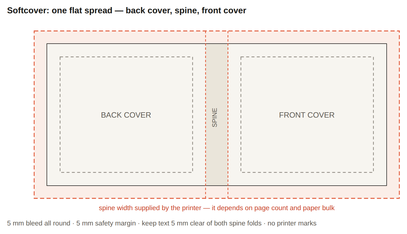
One flat spread, laid out left to right as: back cover — spine — front cover, in one page, with 3 mm bleed all round. The spine width comes from us — it depends on page count, paper bulk and binding method, and it is not something you can estimate reliably. Keep text and logos at least 5 mm away from the spine folds on both sides; perfect binding tolerance means a design element sitting exactly on the fold will end up slightly on the wrong face.
With flaps, the spread runs: front flap — back cover — spine — front cover — back flap. Flap widths come from us too.
Hardcover (case bound)
- Wrap / turn-in: 20 mm of extra artwork on all outer edges, which folds around the board to the inside. This is in addition to normal bleed and it is visible on the inside of the case, so it is real artwork, not throwaway — carry your background, texture or pattern all the way through it rather than letting it stop at the board edge.
- Hinge / joint: 12 mm on each side of the spine. This is where the case bends when the book opens; the material is compressed into a groove. Keep type and critical detail out of it.
- Endpapers, dust jacket and belly band are separate files again, each with their own dimensions from us.
Wire-O and spiral
Keep everything at least 13 mm (softcover) or 16 mm (hardcover) away from the bound edge — that strip is punched out.
8. Exporting a print-ready PDF, step by step
The target is the same in every application. Four things have to be true of the file you send us:
- PDF/X-1a:2001 — CMYK only, transparency flattened, fonts embedded.
- No ICC profiles embedded in the file. Convert your colours to the profile we specified during the export, then leave the profile out of the PDF. PDF/X-1a does this by itself: the profile inclusion policy is fixed at Don’t Include Profiles and cannot be changed. Where an application gives you the choice, choose not to embed.
- No printer marks. No crop or trim marks, no registration marks, no colour bars, no page information, no slug. The page you send us is the page plus its bleed, and nothing else.
- 3 mm bleed included on every outer edge, and every page exported as a single page.
Never send a native working file (.indd, .afpub, .qxp, .sla) as the print file, and never “print to PDF” from a printer driver. Both lose bleed and colour control. Always use the application’s own Export command.
One note on transparency. PDF/X-1a does not support live transparency, so drop shadows, glows, blend modes and feathered edges are flattened at export. That is fine — but flatten at high resolution (all the settings below do), and avoid placing transparent objects directly over spot colours or over text you cannot afford to have rasterised.
Adobe InDesign
Set up
- File > New > Document. Units mm; Width and Height = trim size; Bleed 3 mm on all four sides (click the chain icon to link them). Leave the slug at 0.
- Edit > Colour Settings. Settings: Europe Prepress 3. CMYK working space = the profile we specified (e.g. PSO Coated v3). Policies: Preserve Embedded Profiles.
- Place images with File > Place. Keep the Links panel free of missing or modified links, and check Effective PPI is ≥ 300.
- Window > Output > Separations Preview. Switch to Ink Limit, set 300%, and look for highlighted areas.
Export
- File > Export → format Adobe PDF (Print).
- Adobe PDF Preset: [PDF/X-1a:2001].
- General: All pages; select Pages, not Spreads. Untick Create Tagged PDF and all interactive elements.
- Compression: Colour and Greyscale — Bicubic Downsampling to 300 ppi for images above 450 ppi; JPEG, Maximum quality. Monochrome — 1200 ppi, CCITT Group 4.
- Marks and Bleeds: leave every mark unticked — no crop marks, no bleed marks, no registration marks, no colour bars, no page information. Tick Use Document Bleed Settings (3 mm). Do not include the slug area.
- Output: Colour Conversion = Convert to Destination (Preserve Numbers); Destination = the profile we specified. Profile Inclusion Policy will read Don’t Include Profiles and is greyed out — that is exactly what we want.
- Advanced: Fonts — Subset below 100%. Transparency Flattener Preset = [High Resolution].
- Export the cover separately as its own single-page PDF.
Adobe Illustrator
Illustrator is right for covers, posters, packaging and single-page items. It is not a book layout tool — for anything with running text over many pages, use InDesign, Publisher or Scribus.
- File > New. Units mm; Width/Height = trim; Colour Mode CMYK; Raster Effects 300 ppi; Bleed 3 mm on all sides.
- Edit > Colour Settings → Europe Prepress 3, CMYK = the profile we specified.
- Effect > Document Raster Effects Settings → 300 ppi. Drop shadows and glows are rasterised at this resolution.
- Embed placed images (Links panel → Embed Image) or supply the links with the file.
- File > Save As → Adobe PDF. Preset [PDF/X-1a:2001].
- Marks and Bleeds: all marks off — no trim marks, registration marks, colour bars or page information. Tick Use Document Bleed Settings (3 mm).
- Output: Convert to Destination (Preserve Numbers); destination = the profile we specified; Profile Inclusion Policy Don’t Include Profiles (fixed under PDF/X-1a).
- Untick Preserve Illustrator Editing Capabilities — it doubles the file size for no benefit to us.
Adobe Photoshop
Photoshop is a last resort for anything containing text. Type exported from Photoshop is rasterised — it will look softer than vector type, and it cannot be corrected. Never set body copy in Photoshop.
- File > New. Size = trim + 3 mm on each side (an A4 page becomes 216 × 303 mm); Resolution 300 ppi; Colour Mode CMYK, 8 bit.
- Edit > Colour Settings → Europe Prepress 3. If the file started in RGB, use Edit > Convert to Profile and choose the profile we specified — not Image > Mode > CMYK, which uses whatever the default happens to be.
- Add guides 3 mm in from each edge (the trim line) and 8 mm in (the safety margin).
- Keep type on live text layers and keep a layered master file.
- File > Save As → Photoshop PDF. Preset [PDF/X-1a:2001]; untick Preserve Photoshop Editing Capabilities and untick ICC Profile / Embed Colour Profile in the Save dialogue.
- Under Output, Colour Conversion = Convert to Destination (Preserve Numbers), destination = the profile we specified, Profile Inclusion Policy Don’t Include Profiles. There are no marks to switch off — just make sure you have not drawn any.
Affinity Publisher and Affinity Designer (v2)
- File > New. Type Print; units mm; Page size = trim; DPI 300; Colour format CMYK 8; Colour profile = the profile we specified. In the Bleed section set 3 mm on all four sides.
- On an existing document: File > Document Setup → the Colour and Bleed tabs.
- Place images with File > Place. Check Window > Resource Manager — nothing missing, nothing modified.
- Run Window > Preflight and clear every warning before exporting.
- File > Export → PDF. Preset: PDF/X-1a:2003 (Affinity labels the X-1a preset 2003; it is the same thing).
- Open More… and confirm: Rasterise = Unsupported properties; Downsample images above 300 dpi; Colour space CMYK; ICC profile = the profile we specified; Embed ICC profile — unticked; Include bleed ✔; and every entry under Include printer marks left unticked.
- Set the range to Pages, not Spreads. Export the cover as its own file.
In Affinity Designer the export dialogue is the same; set the bleed in Document Setup and export the artboard.
Scribus (1.6 and newer)
- File > New. Set the page size to trim, and in the same dialogue open Bleeds and set 3 mm on all sides.
- File > Document Setup > Colour Management. Turn colour management on and set the printer / solid colours profile to the CMYK profile we specified.
- Build your palette in CMYK: Edit > Colours and Fills. Delete leftover RGB swatches.
- Run Window > Preflight Verifier and fix everything it reports.
- File > Export > Save as PDF.
- General tab: Compatibility PDF/X-1a; export All Pages; Compression Automatic, Quality Maximum, resample images above 300 dpi.
- Pre-Press tab: tick Use Document Bleeds (3 mm). Leave Crop Marks, Bleed Marks, Registration Marks, Colour Bars and Page Information all unticked.
- Colour tab: Output Intended For: Printer; tick Convert Spot Colours to Process unless the job really is a spot-colour job. Scribus writes the X-1a output intent by name and does not embed per-object profiles — leave Don’t use embedded colour profiles ticked so nothing extra travels with the file.
- Fonts tab: embed or outline every font in the list.
- Save, then check the result (next section).
QuarkXPress
- File > New > Project. Layout type Print; page size = trim; units mm.
- Edit > Colour Setups > Output. Create or choose an output setup based on the CMYK profile we specified; set the source setup to a European prepress setup.
- Utilities > Usage. Check the Fonts and Pictures tabs — nothing missing or modified, effective resolution ≥ 300 dpi.
- File > Export > Layout as PDF.
- PDF Style: PDF/X-1a. Then click Options.
- Pages panel: export as Pages, not Spreads.
- Marks panel: Mode Off. No crop marks, no registration marks, no colour bars.
- Bleed panel: Bleed Type Symmetric, Amount 3 mm, tick Clip at Bleed Edge.
- Colour panel: composite output, Setup = your CMYK output setup. Under the output setup, set Colour Options so that source profiles are converted and not embedded — PDF/X-1a enforces this, but check it rather than assume it.
- Fonts panel: download / embed all fonts.
- Save.
Canva, Word, PowerPoint, Google Docs
These tools were not built for commercial print. They work in RGB, they cannot create true bleed on every page, they do not embed CMYK profiles, and they substitute fonts silently when a file moves between machines.
Canva’s PDF Print export is usable for a simple cover or a short brochure, but the file will still be RGB and colours will shift when we convert it. Canva also bundles bleed and crop marks into a single checkbox, so you cannot have the bleed without the marks — and we need the marks off. For a book, an annual report or anything colour-critical, please use one of the applications above — or ask us for a quote for our DTP and prepress service and we will typeset it for you from your text and images.
If you have no choice, do this instead of using Canva’s bleed option: make the canvas 6 mm wider and 6 mm taller than the finished size and run your background all the way to the edge of that oversized canvas. That gives you a real 3 mm bleed on every side. Keep all text and logos at least 8 mm in from the edge of the canvas, export as PDF Print with crop marks and bleed switched off, and tell us the finished trim size in your email so we know where to cut.
9. Check your PDF before you send it
Two minutes here saves days later. Open the exported PDF — the actual file you are about to send, not the layout it came from.
In Adobe Acrobat Pro
- File > Properties > Description — check the page size. With bleed included it should be trim + 6 mm in both directions (216 × 303 mm for an A4 page).
- Check there are no printer marks on the page. If you can see crop marks, registration targets or a colour bar around the artwork, the export settings were wrong — go back and switch them off rather than sending the file.
- File > Properties > Fonts — every entry should say Embedded or Embedded Subset.
- Print Production > Output Preview — turn on Simulate Overprinting. Switch the list to Separations and hover over black text: only the K plate should show a value, and no page should show an RGB or spot plate you did not intend. Set Total Area Coverage to 300% to highlight anywhere you exceed the ink limit.
- Print Production > Preflight — run the PDF/X-1a compliance profile. It will also tell you if any ICC profile is still embedded in the file.
- Scroll every page. Check the page count, the page order, and that no page is rotated or duplicated.
- Zoom to 400% on your most detailed images. If they look soft here, they will look soft on paper.
If you only have the free Acrobat Reader
You can still check the three things that catch most errors: page size, page count and font embedding (all under File > Properties). Then look at the page edges — a page with bleed shows the artwork continuing past where the trim will be, usually visible as a slightly larger page than you expect.
10. Sending the files to us
- One PDF for the text block — all pages, in order, as single pages.
- One separate PDF for the cover — as a flat spread including the spine (and flaps, if any).
- Separate PDFs for endpapers, dust jacket, belly band, inserts and anything else printed separately.
- Name files clearly and consistently:
Title_Author_interior_v2.pdf,Title_Author_cover_v2.pdf. Avoid spaces, slashes and accented or national characters — they break on some systems. - Always version your files and tell us explicitly which file replaces which. “The new one” is not a version number.
- Send via the upload link we give you, or by WeTransfer to your contact person.
- Tell us about references. If you have a contract proof, a previous edition or a printed sample you want us to match, say so up front — colour matching only means something against a physical reference.
11. The mistakes we see most often
| What is in the file | What happens on paper |
|---|---|
| RGB images left in a CMYK job | Colour shifts — vivid blues and greens go flat and grey |
| No bleed | Thin white slivers along the trimmed edges |
| Text sitting 2 mm from the trim | Cut off, or visibly crooked relative to the edge |
| 72 ppi images pulled from a website | Soft, blocky, obviously low quality |
| Fonts not embedded | Substituted typeface, reflowed text, changed page count |
| Spreads instead of single pages | We cannot impose the job until it is split — delay, and lost bleed at the gutter |
| Blank pages omitted from the PDF | Page count mismatch; the whole book shifts by one page |
| Cover exported at page size, without the spine | Unusable — the cover has to be redone |
| Small text in rich black | Blurred, colour-fringed letters |
| Ink coverage over 300% | Set-off onto the next sheet, marking, cracking at folds |
| Hairlines below 0.25 pt | Rules break up or vanish |
| Pantone swatches in a 4-colour job | Unpredictable conversion, or an extra plate you did not pay for |
| Crop marks and colour bars exported into the file | They land in the middle of the imposed press sheet — the file has to be re-exported |
| ICC profile still embedded in the PDF | A second, competing colour instruction — the file has to be re-checked before it can go to plate |
| Text running across the gutter of a perfect bound book | Words disappear into the glue |
12. The pre-flight checklist
Tick every line before you send anything.
- Document built at final trim size, in millimetres
- 3 mm bleed on all outer edges, and artwork actually extends into it
- Nothing important closer than 5 mm to the trim; 10 mm at the spine
- Everything converted to CMYK using the profile we specified — and no ICC profile left embedded in the PDF
- No printer marks of any kind: no crop, bleed or registration marks, no colour bars, no page information
- No stray RGB images and no Pantone swatches in a 4-colour job
- Total ink coverage nowhere above 300%
- Small text and thin rules in 100% K only
- All images 300 ppi at final size (1200 ppi for bitmap line art)
- All fonts embedded or outlined
- Nothing thinner than 0.25 pt
- Single pages, in order, blanks included — not spreads
- Page count matches the order and the binding rules
- Cover supplied as a separate flat spread with the spine width we gave you
- Exported as PDF/X-1a:2001 via the application’s File > Export command
- PDF opened and checked: page size, page count, fonts, separations, no marks
- Files clearly named and versioned
Not sure about your files?
Send them to us before the deadline, not with it. We check every file that comes in, and we would much rather tell you about a problem now than after 3,000 copies are printed. If you would prefer not to deal with any of this, our DTP and prepress team can prepare the files for you.